|
Button Settings Overview |
The Button Settings Tab displays the settings of a selected Button.
It allows you to
 define the type of action executed, if the button is clicked (Mari Action, Script etc.)
change the button type (button, line, slider, checkbox etc.)
change the button section (Top, Bottom, Center)
change the button position within a section
overwrite the visual style of a button

|
|
Some attributes are not visible for all Button Types |
The Status Section displays information about the State and Functionality of the selected Button.
Detailed information is displayed in Tooltips to aid in identifying problems and conflicts
|
|
Green identifies a fully working button Orange could mean a potential problem however it could be intentional Red means an issue with the button configuration was detected, preventing it from working |
Example of a tooltip displaying information about the Status of a Button

The Behavior Section allows you to configure the type of button, button functionality to be executed and its visibility

•Show Button
Makes the Button visible in the current Menu
The Text displayed on the Button or on the Button Tooltip (if Button is an Icon)
|
|
The Display Name and Button Name in the Button List can be different |
•Button Type
The Type of Functionality mapped to the current Button.
|
|
You can freely swap between Button Types. All states are remembered, so they will be exactly like you left them when you switch the button type |
Mari Action
Launch a Mari action when the Button is executed.
A Mari Action is any command accessible within in Mari that is also available in Mari's Hotkey Editor.
The action to launch is set under Button Functionality
Python Code
Launch Python Code when the Button is executed.
The Python Code to launch is set under Button Functionality
Image Load
Load an Image into the Image Manager and set it as a Paint Through Image.
The Image Path to load is set under Button Functionality
Submenu
Open a Submenu Hotbox when the button is executed.
The Submenu link can be defined under Button Functionality
|
|
- Hotbox Submenus for the current Hotbox need to be defined via the Add Submenu Button in the Hotbox List. - This option is not available if the current button already is part of a Submenu |
Example of a Submenu attached to a Button

 Slider
Instead of a button display a slider. A hotbox slider can be linked to a slider in the Mari interface.
The Functionality of the Slider can be defined under Button Functionality
Example of a Hotbox Slider

|
|
|

Checkbox
Instead of a button display a checkbox. A hotbox checkbox can be linked to a checkbox in the Mari interface.
The Functionality of the Checkbox can be defined under Button Functionality
Example of an unchecked & checked
Checkbox in a Hotbox

Spacer (100% , 50%, 25%)
Display an empty space instead of a button.
The width of the empty space is 100%, 50% or 25% of the Button Size defined in the Style Section of the Hotbox Settings
Spacer (Custom)
Display an empty space instead of a button.
The width of the empty space can be defined in the Custom Style Section of the Button
Vertical Line
Displays a vertical Line instead of a button.
This is useful to add a visual separator in your Hotbox.
Horizontal Line
Displays a horizontal Line instead of a button.
This is useful to add a visual separator in your Hotbox.
•Button Functionality
Allows you to set the Functionality such as which Mari Action to execute, what Python Code to launch etc.
For more information please refer to the Setting Button Functionality section of this help
|
|
This attribute is only visible for Button Types that support setting a functionality |
•Visible If
Visible If allows you to build Hotboxes that change dynamically based on context.
Currently you can show/hide elements of a hotbox based on selected Tools or selected node types in the Nodegraph.
Always
The Button is always visible unless other visibility conditions (hidden by user, conflict etc.) prevent visibility.
Matches Context
The Button is only shown if the Context defined under Visibility Context matches
Allows you to set the Context in which the Button is visible.
For more information please refer to the Context Sensitive Buttons section of this help
|
|
This attribute is only shown if Visible if is set to Matches Context |
The Position Group contains settings to control the placement of the current button within the Hotbox

•Row
Set the Section (Top, Center, Bottom) of the Hotbox, the Button belongs to
|
|
The center section can usually only display two buttons at the same time. |
•Button Position
The Button Position is a unique index for each button determining the order of buttons.
The numbers don't need to be incremental e.g a numbering of buttons 1,2,4,8,12 is totally acceptable.
Each Button in a Hotbox should have a unique number.
|
|
- If two buttons share the same ID the position of each is determined randomly on each launch of a hotbox - Two buttons can share the same ID Number and not be in conflict with each other if a Visible If context is defined for both
|

Conflicts in Button Positions are displayed in the Status Section with additional information displayed in the tooltip

•Pixel Offset X/Y
Allows you to offset the Position of the Button within the Hotbox.
|
|
This attribute is only visible under certain conditions |
Pixel Offset Options are only visible if any of the below conditions are met
The Hotbox is a Dial Hotbox
The Button Type is a Slider or Checkbox
|
Button Presets |
Button Presets allow you to save Presets for the "Custom Style" Section of a Button.
The Custom Style Group offers options to overwrite the style of a specific button so it is different than the style defined in the Hotbox Settings

•Inherit Hotbox Style
If on, the Button has the look and feel defined in the Hotbox Settings
If off, the Button takes its style queues from the Options below.
•Button Color
Determines the background color of buttons and slider color for sliders

•Active Range / Inactive Range
If the Button Type is a Slider , new options become visible to set the color of the active and inactive range
of the slider

•Button Text Color
Determines the Font Color of the Center Button

•Button Border Color
Determines the Color of the Button Border.

For Button Type Checkbox this determines the color of the Checkbox

•Button Height
Determines the Height of button

•Button Width
Determines the width of the button

•Button Roundness
Determines the Corner Radius of the button
|
|
The maximum corner radius is determined by the Button Width and Height |

•Border Highlighting
Border Highlighting will only highlight the borders of a button when the Cursor is hovering above it, instead of the whole button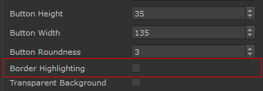
Border Highlighting off vs Border Highlighting on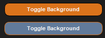
•Transparent Background
The Transparent Background Setting determines if a background is drawn behind the Button Text or Button Icon

•Use Icon
If on, the supplied Icon will be shown instead of the Display Name.
If an icon is drawn and Show Tooltips on Icons is turned on in the Hotbox Settings, the Display Name of the Button is shown
as a tooltip when the mouse is hovering above the button

•Fixed Icon Size
If on, the original icon size (resolution of supplied image) is used to draw the icon.
If off, the supplied image is rescaled to fill the Button Width and Height
•Icon
Select an Image from Disc to display as an Icon if Use Icon is turned on.
|
|
Since icons are loaded each time a hotbox is launched, the icon file size should be as small as possible ! |
While Icon paths are defined as an absolute path, the Hotbox Systems has several methods to locate an icon even
if the file path on disc has changed:
If the file path on disc no longer exists but a file with the name exists in the current Hotbox Folder, this file is used instead.
|
|
It is recommended to always place icon files inside your Hotbox Configuration folder to not loose them |
If an icon is picked from the Mari Installation Folder (e.g C:\Program Files\Mari4.5v1\Bundle\Media\Icons) the path
is automatically converted to a Mari Icon Path, meaning it will always be found regardless
If an icon is picked from the Extension Pack Installation Folder the path
is automatically converted to a Extension Pack Icon Path, meaning it will always be found regardless
PREVIOUS PAGE: Button Settings
NEXT PAGE: Setting Button Functionality